I feel that this project has been extremely productive and helpful to me as a creative/ designer.
Working in a group has helped me to learn new skills across a variety of areas and opened my eyes to the possibilities within art. It has been an experience that has consisted of highs and lows, but mainly highs! Working closely together every day creates brilliant opportunity and an interesting melting pot of ideas. Whilst working in this unit x group, I have discovered that ideas can be taken so much further in a shorter space of time and feedback from others in the group can help your own work to evolve into art of a higher quality.
However I think we also feel that working in a group that is possibly too large can stop the ideas in their tracks which we learnt when a couple of people joined our group a week in, when we had already got the ball rolling on our shared ideas. However working through this we found that communication is key, and keeping up to date on each other's work can help to spur your own work along. I also learnt that involvement and compromise are essential.
There has been many things I have learnt from my fellow students such as delegation skills (Martina), practical skills, such as ways of experimenting with unexpected materials, and I have also learnt that film can be a brilliantly impressive tool to use within a project and for pitching to clients. I learnt this from Tom's research video which got spades of positive feedback. Therefore I will be looking at using this method within future projects. I feel like I have gained a wealth of knowledge from my group for which I am grateful. I think I work well whilst collaborating with other artists and I will be looking to do this again soon.
Working in a group gave me a push to further my own ideas and also to use methods that I don't usually think about using. For example my main practice this year has been print design for fashion however in this project I have used methods such as embroidery, 3D construction and sculpture. I have really enjoyed using these methods and it has made me realise that maybe combining these with print would be a way forward within my own practice.
We had ideas within our work that sometimes we could not show in their true form, however we found ways of presenting our ideas through more lo-fi methods which I think was a skill we all learned throughout the project. Using this skill of representation can help people to see your ideas on a larger scale and it helps to push other wise small scale ideas a lot further.
Ending this project, I feel that as a group we have worked together tremendously well and I could see us working together again on projects similar to this. We have been asked to work on a project for the new Art and Design building opening in October which is a testament to all of the hard work that everyone in the group has thrown at this project whole heartedly from the very beginning!
On a more personal note I have been approached by a fashion student who would like to collaborate with me on a future project which I am very excited about. I feel that I can use all of the skills I have learnt from this experience to work with her in a productive and exciting way and I will carry on using this knowledge throughout my creative career.
Friday, 17 May 2013
Thursday, 16 May 2013


Ferrofluid

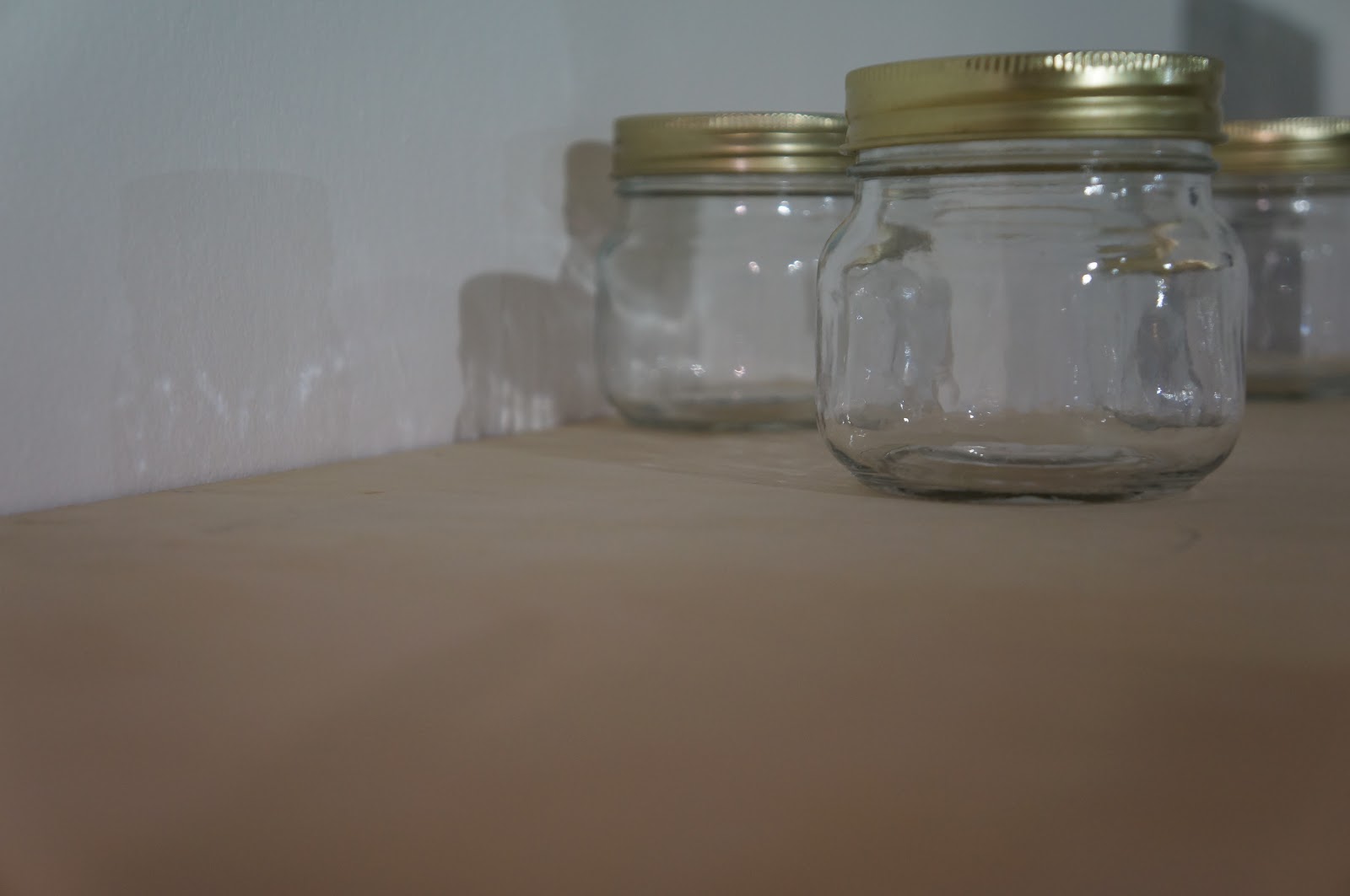
Ursula and Martina's ferrofluid jars were a massive hit at the exhibition opening! Ferrofluid is a magnetic substance and is made from toner and vegetable oil. We thought that it would be a fun interactive piece to include in the exhibition.
Wednesday, 15 May 2013
Promotional Gift Bags

We thought it would be a good idea to create some small gift bags as exhibition favours to promote our festival ideas. I offered to make the bags and in them I included:
- Glow in the dark 'VOID' map
- Business card ( designed by Emily Jackson)
- Manifesto (on front of each bag)
- 'VOID' Resin tile (in a 'VOID' envelope)
- Magic Eye flyer
- 'VOID' wristband (made by Martina Billson)
Monday, 13 May 2013
VOID Maps
 |
| Design by Ursula Rae, Hannah Sulek |
We wanted our map to be concealed within the 'daytime festival' map. Concealed in the light revealed in the dark. Ursula created the simple map as the basis of the design then Hannah cut out the area of the map that we would be using for our festival. The Salford/ Manchester border.
We also played around with blacking out the area and using glow in the dark maps.
I created a secondary map for our 'Glow Brick Road' using the same design.
Friday, 10 May 2013
VOID Manifesto
 |
| Manifesto layout designed by Ursula Rae |
As a group we decided to create a manifesto to summarise what our festival is all about. It gives people a sense of what we hope to create and how we will do it. It took a couple of read throughs and edits to get it right but I think that the final draft is on point and intriguing. The points of our manifesto are:
- An alternative layer to a Manchester Design Festival. (We will create night time design events to run alongside a daytime festival)
- An evolving festival through the interaction of participants. (We would like the events and happenings within the festival to be partly determined by the public by interacting with the installations/ designs)
- Creating individual and collective experience.
- Changing appearance through manipulated conditions. (Redesigning the city through intangible design)
- Concealed within the light revealed within the dark. (Artwork that goes unnoticed in the day but reveals its self when night time falls)
- Absence can be as stimulating as presence. (Trying to get people to notice and experience design where it is otherwise hidden)
- Facilitating interaction within the space and each other.
- Using artist networks to generate momentum and encourage organic growth. (Using already established artists to attract the public to design and therefore help the design community to grow in an unforced way)
- Intangible Design (design which does not have a physical presence)
- Generating activity in a non-space.
- Not reflecting on the past or concerning the future, but experiencing the now. (We're not giving our energy to Manchester's past or future but we are focusing on the present to encourage people to enjoy the city's spaces as they are now)
Wednesday, 8 May 2013
Promotional Resin Bricks

I thought that it would be nice if we had an alternative promotional tool to hand out for the festival. These are resin cubes with embedded images within them. The images include:
- Logo
- Visuals
- Void Map
I think they're a fun way of involving people in the festival and people, especially children love to collect objects that they can keep as memories.
The Logo

This logo, in the first instance, represents a 'void'. Secondly it represents the organic growth of our festival, spreading and flowing from one point in the city outwards.
I created this logo by dropping ink onto a dampened piece of paper and letting it spread. I used black ink as it is a simple, uniform colour and it's also bold. When i think of a void I think of a black hole, hence the denseness of the logo. I then scanned the image in and intensified the colour by altering the contrast settings. Finally I added the title of our festival using our chosen font; Helvetica Neue, for a uniform look.
We thought it was important to have an overall logo for promotion purposes so we do not confuse the public and in doing so put them off attending the events. It also brings all of the separate elements of our work and events together.
Saturday, 4 May 2013
Final Magic Eye Promo Flyers


I used the name of our festival 'VOID' and the date to create the final promotional magic eye flyers. They give snippets of information without giving too much away about the content. These would be one of our main promotional outlets and we have received brilliant feedback about them so far.
Subscribe to:
Comments (Atom)