Sunday, 19 February 2012

Shelly Goldsmith Lecture

On Tuesday 7th Febuary I attended a lecture by Shelly Goldsmith about her work and practise. She talked about the thought processes behind her art and it became clear that there is always a reason and a meaning behind each piece. 
She started her career as a tapestry weaver however she has now turned more towards fine art textiles in which she seems to use a number of hand processes such as hand stitching. I like the sense of emotion behind her artwork, an example being her delicate printed children's dresses which showed images of natural disasters and traumatic scenes. 

 'No Escape'

I also found her newest work very interesting. It's about how she believes textiles and clothing can 'absorb' events and experiences of the owner throughout its life span and that these can never be washed away or forgotten. She used her families experiences to create pieces of art with stories stitched into them, usually where she thought the body would touch the inside of the clothing most. She also involved a lot of forensic links within this work. 


Shelly said that it is very important to her to research and explore for a long period of time before creating her work and that it is also important to push boundries and techniques to the limit.

Thursday, 9 February 2012

SAMPLES IN PROGRESS...

After testing out yarn qualities and various patterns I have started to create my final samples. Here are my samples in progress...


TBC...


Friday, 3 February 2012

WEAVING THE SKY...

I have been testing out different yarns and patterns in my weaving to decide which techniques and colours to use in my final samples...


SAMPLING - Part 2

For the second half of the sampling unit I have decided to look at the 'change of colour in the sky' as I thought this would be an interesting and suiting development from my work in the first half.
I have taken images and started to translate the colour into drawings and colour wrappings.


Thursday, 19 January 2012

SAMPLING - HALF WAY...

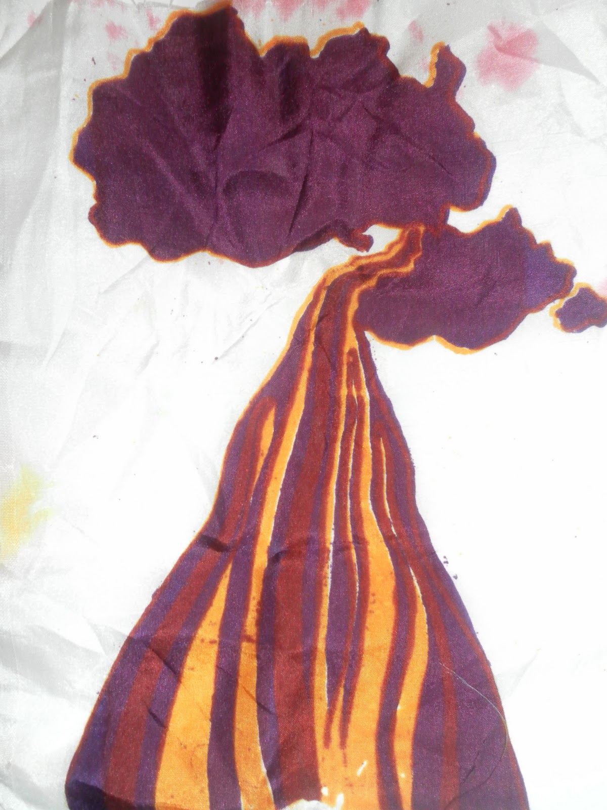
For the first workshop in this unit I chose INTERMEDIATE PRINT. I chose intermediate print as I wanted to further my skills in a workshop I had already done and enjoyed. I also thought I would be able to link the workshop to my project in a strong way. As we were using dyes in this workshop instead of pigment, we had no choice but to use pure silks or wools . As a result I have used more silk as I wanted my prints to be strong but also quite delicate as are clouds. As this was now intermediate print, we were asked to design a multiple colour/layer image to print. This would add more depth to our samples. I chose to use a double layer image with overlaps, therefore creating 3 colours in my prints. 


My image idea came from my starting point of clouds and rain however I also took inspiration from the japanese print artist HOKUSAI. I looked at how he portrayed water in his artwork which was abstract but I wanted to make my design more modern and up to date and found myself designing with a pop art influence. 


We also had the choice of pre dying our fabric and then printing on top of it with a special dye. I very much enjoyed using this technique even though the samples took a long time to make and it was a bit hit and miss with the colours! I liked the watery, almost fluid look the dip dying gave to my samples. 


I thought that the two layers would give my design enough scope and interest however after a while and after looking around at other people's samples I think it would have been more interesting to use more layers in my design and I would keep this in mind next time I use print. 
I have used two sketchbooks so far in this unit and it has really helped me and my thought processes as I have progressed through this project. I have been using one for small samples and ideas separate to my print and another that has been running alongside my workshop. I have also found that drawing in my sketchbook has helped me to further my ideas and give me colour inspiration. 


After I had produced a number of samples I set about thinking of ways to present them and thought it best to present them hanging or lying side by side as a series of prints as the nature of my prints are quite bold an this way they can be seen clearly. However I have also thought about using this design as a textiles for fashion. this way my work would have a link to an industry that I am greatly interested in. I like the idea of my work having a purpose or use. I would make this possible by either printing this screen on a larger piece of fabric as a repetitive pattern or scaling my images down and creating a new screen with the repetitive pattern already on it. This could link into the second half of this project which is about development of ideas. I definitely would like to develop my prints more, adding different colours, effects and also maybe printing onto handmade backgrounds as my next workshop is weave. As well as thinking bout developing my printing, I have also thought about developing my work in the way of coloured and dyed fabrics relating to clouds and the atmosphere. I also think I need to incorporate my opposite, 'calm and stormy' more in the second half of the unit as it may help more with my ideas.


Sunday, 15 January 2012

COLOUR SAMPLING

Our lecturers have told us that colour is going to play a large part in this project. We did a workshop on colour sampling to start us off.
As my theme is 'the Atmosphere' there are many colours that I could use for my samples as the sky changes constantly, however I have chosen a few core colours for the moment...


The colours that I have chosen will probably change throughout the sampling project however  I think it is good to have a strong set of colours to start with. Even though I am used to using quite strong colour in all of my work, it is helpful to use colour sampling skills to determine the right hues and tones and it is a skill that I will carry on using in the future.

SAMPLING

For the 'sampling' unit I decided to to choose a subject I had briefly encountered before in my work outside of university which is 'the atmosphere'. We were also told to add an opposite to this to guide us through the project, mine being 'calm & stormy'. 
I began by taking photos of the current weather and the sky in and around Manchester for inspiration...

I wanted to take as many photos as I could to document the changes in conditions and the colour palettes they brought about. From these I did some initial drawings and sampling to kickstart my project.