For the first workshop in this unit I chose INTERMEDIATE PRINT. I chose intermediate print as I wanted to further my skills in a workshop I had already done and enjoyed. I also thought I would be able to link the workshop to my project in a strong way. As we were using dyes in this workshop instead of pigment, we had no choice but to use pure silks or wools . As a result I have used more silk as I wanted my prints to be strong but also quite delicate as are clouds. As this was now intermediate print, we were asked to design a multiple colour/layer image to print. This would add more depth to our samples. I chose to use a double layer image with overlaps, therefore creating 3 colours in my prints.


My image idea came from my starting point of clouds and rain however I also took inspiration from the japanese print artist HOKUSAI. I looked at how he portrayed water in his artwork which was abstract but I wanted to make my design more modern and up to date and found myself designing with a pop art influence.
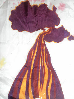
We also had the choice of pre dying our fabric and then printing on top of it with a special dye. I very much enjoyed using this technique even though the samples took a long time to make and it was a bit hit and miss with the colours! I liked the watery, almost fluid look the dip dying gave to my samples.
I thought that the two layers would give my design enough scope and interest however after a while and after looking around at other people's samples I think it would have been more interesting to use more layers in my design and I would keep this in mind next time I use print.
I have used two sketchbooks so far in this unit and it has really helped me and my thought processes as I have progressed through this project. I have been using one for small samples and ideas separate to my print and another that has been running alongside my workshop. I have also found that drawing in my sketchbook has helped me to further my ideas and give me colour inspiration.

After I had produced a number of samples I set about thinking of ways to present them and thought it best to present them hanging or lying side by side as a series of prints as the nature of my prints are quite bold an this way they can be seen clearly. However I have also thought about using this design as a textiles for fashion. this way my work would have a link to an industry that I am greatly interested in. I like the idea of my work having a purpose or use. I would make this possible by either printing this screen on a larger piece of fabric as a repetitive pattern or scaling my images down and creating a new screen with the repetitive pattern already on it. This could link into the second half of this project which is about development of ideas. I definitely would like to develop my prints more, adding different colours, effects and also maybe printing onto handmade backgrounds as my next workshop is weave. As well as thinking bout developing my printing, I have also thought about developing my work in the way of coloured and dyed fabrics relating to clouds and the atmosphere. I also think I need to incorporate my opposite, 'calm and stormy' more in the second half of the unit as it may help more with my ideas.


 I picked PRINTED TEXTILES as my first workshop as I wanted to look into designing and making textiles for fashion related to the subject that I'd chosen. Therefore in the first part of my sketchbook i used black and white but bold images as I was exploring different options that I could use for my screen. Eventually I started to add more and more colour to add more interest to my work. The colours that I decided to work with linked to the colours that were associated with Factory Records such as yellows, black and metallics. These are also the colours that I used for my prints.
